Aries Arise
E-commerce
UI design
User research
User Experience
Aries Arise is an urban streetwear brand quickly making a name for itself whilst collaborating with some the largest brands and celebrities across the world.
The Challenge
Aries Arise wanted to shift their website over on to Shopfiy 2.0 whilst also refreshing their websites look and feel. Working with their internal design and distribution team, my task was to create a new look and feel for Aries Arise whilst retaining the punk yet authentic identity which appeals so well to their audience.


The approach
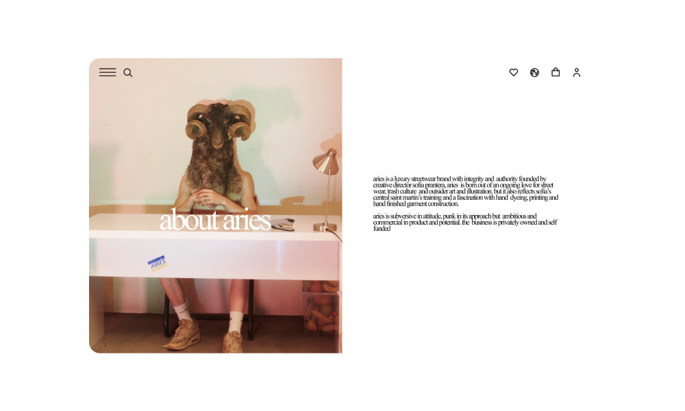
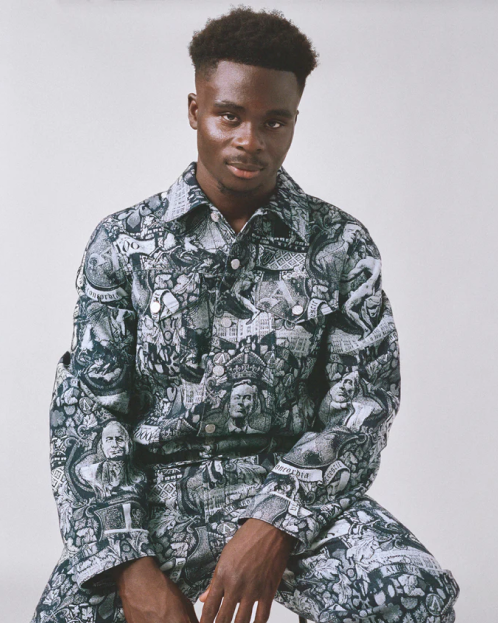
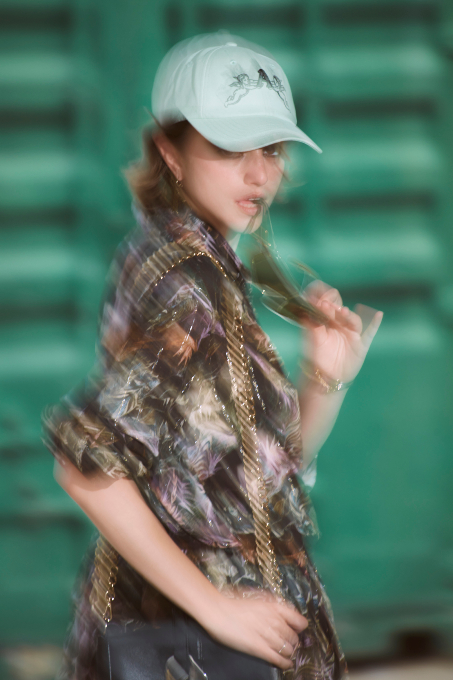
Sofia who is the founder and creative director of Aries Arise has a background in hand dyeing and printing. We wanted to make ensure the 'rolled up sleeves' and 'hand made' feel was oozing through the screen.
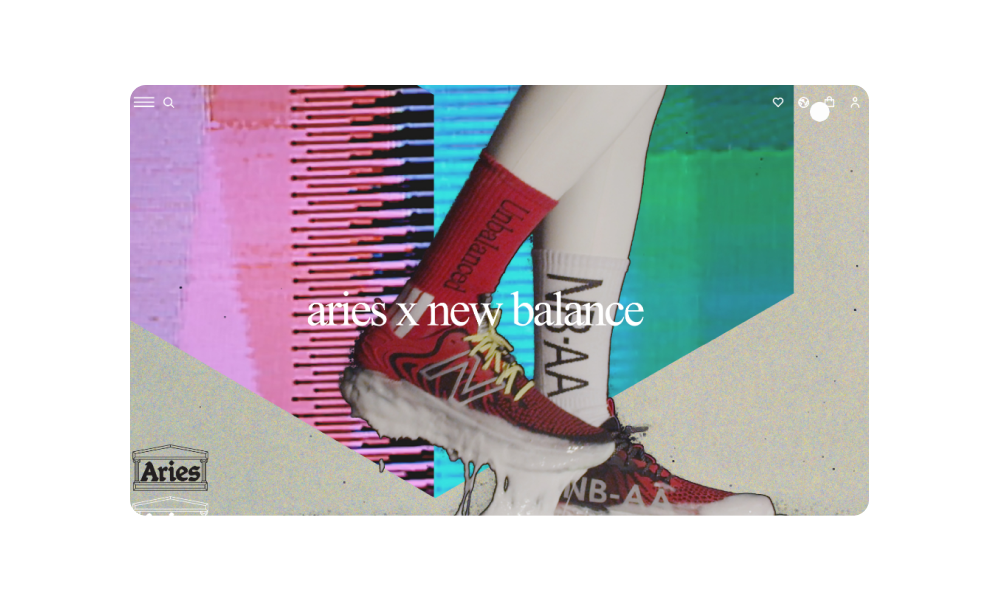
This aproach was achieved via high contrast flash photography, grain and noise filters combined with a vibrant colour pallete that felt loud and saturated yet pleasing to the eye on content heavy pages.
This aproach was achieved via high contrast flash photography, grain and noise filters combined with a vibrant colour pallete that felt loud and saturated yet pleasing to the eye on content heavy pages.
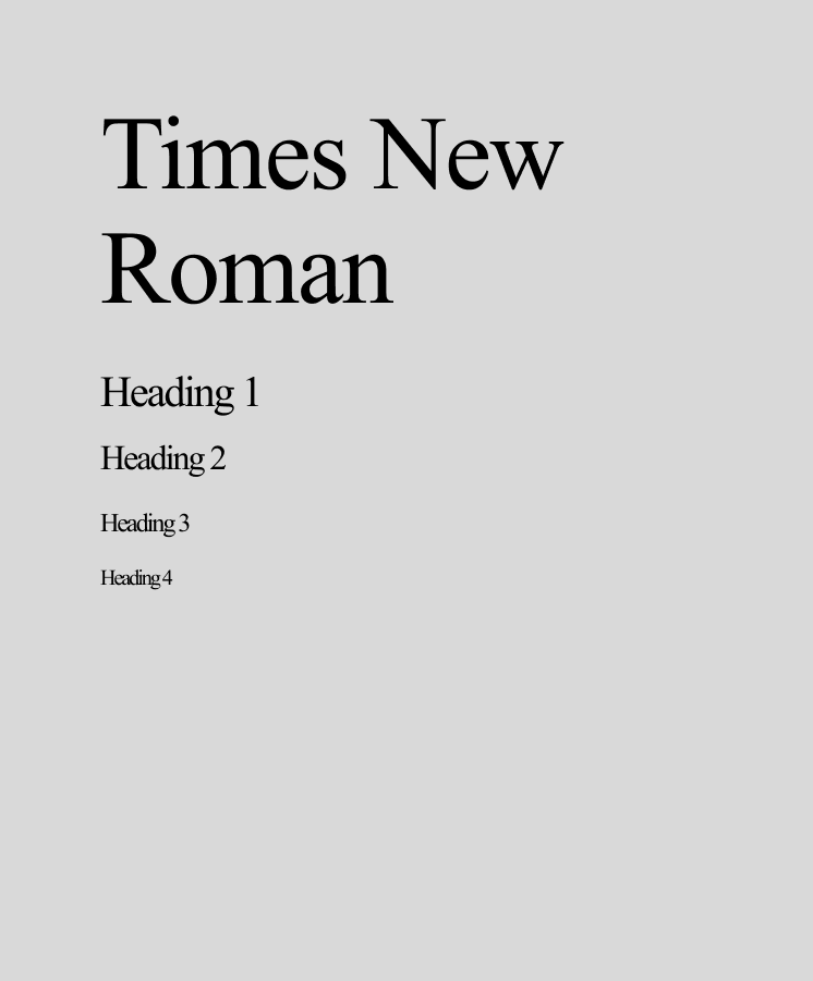
Visual design & branding
#000000
#CBCBCA
#86BBAD
#DFBABC
Times New Roman
Aa


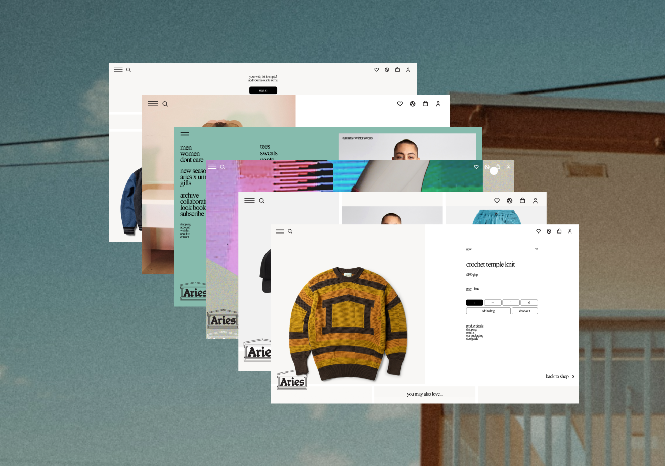
UX Improvements
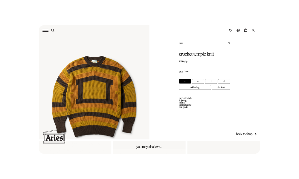
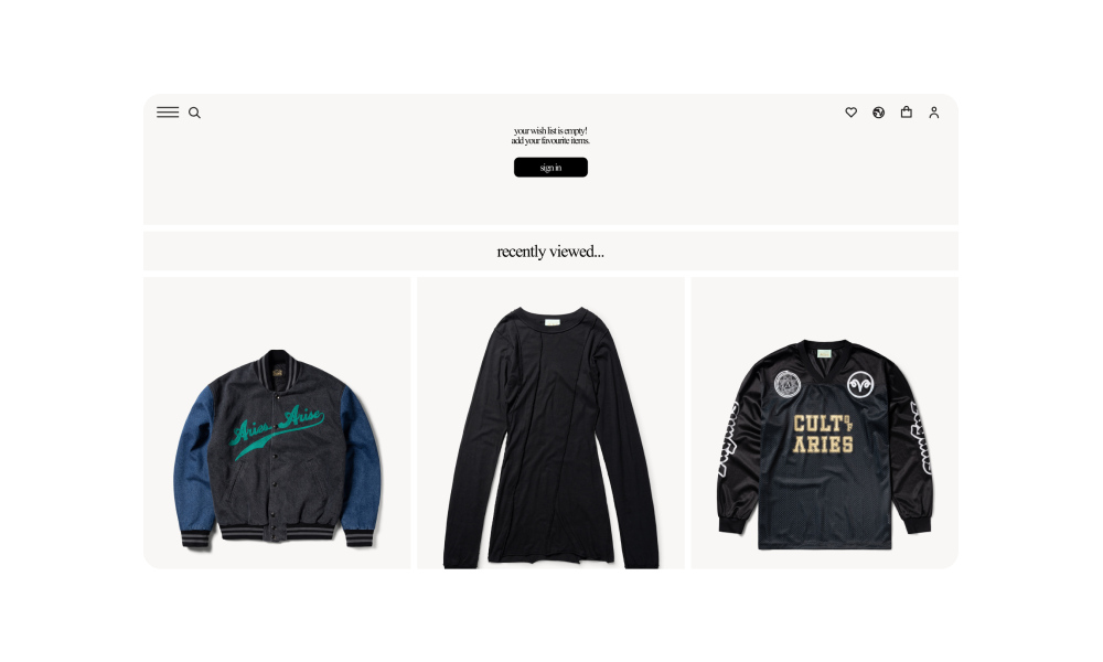
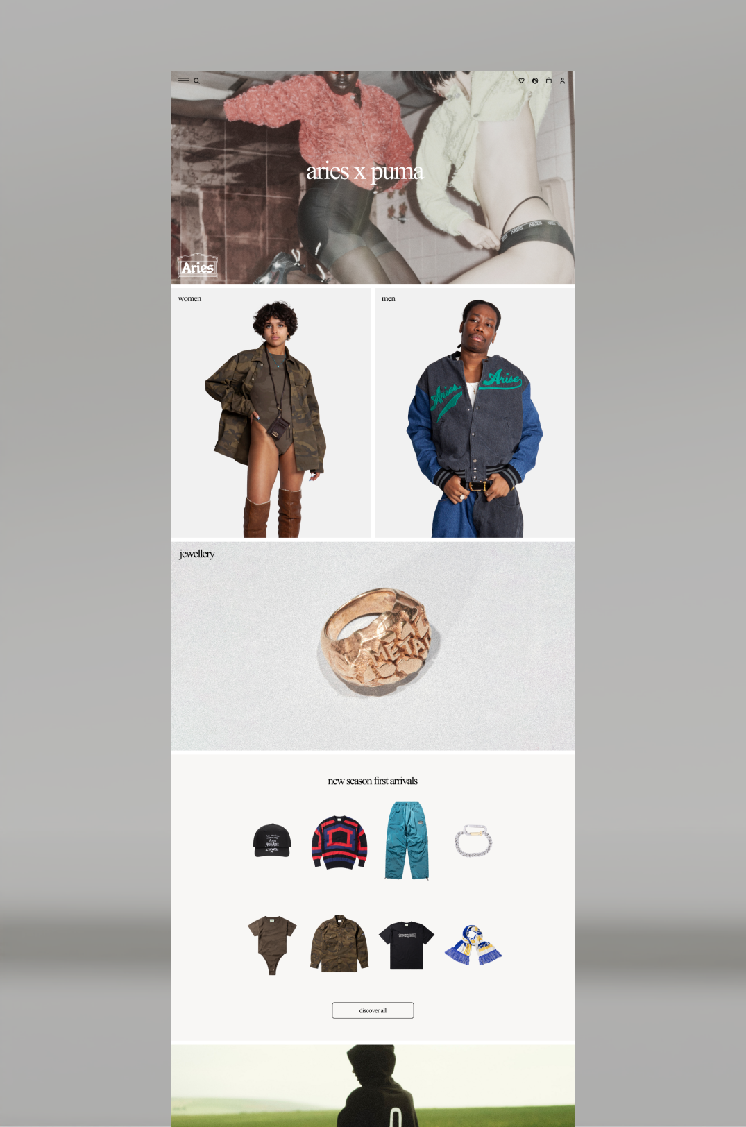
Collection filters
The product page always has an easy access collection filter visible while scrolling as a key user frustration was having to scroll back up to change the filter option causing the user to lose the item they were looking at.
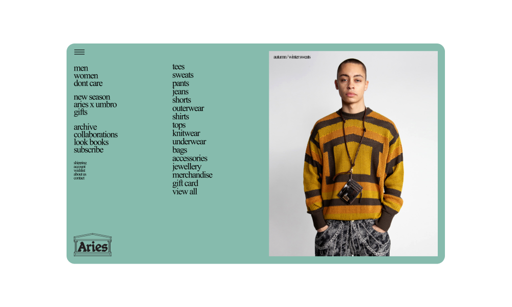
Navigation
Navigation was streamlined by reducing visual clutter and repositioning key icons. The search and menu icons were placed side by side to simplify product browsing. All user-focused features were grouped on the right, creating a more intuitive experience. These updates aligned with Aries Arise’s new vision, which was to place products and collections at the forefront of the customer journey.
Optimised mobile useability
Compressed imagery and videos to reduce load times and bounce rates.
Final screens